Standard Bank Group
My360 App Enhancements
Continuous improvement work on a wealth management mobile app serving Standard Bank Group customers across Android and iOS, with a focus on reducing friction, improving usability and expanding the product suite.
Year
2023
Platform
Android · iOS
Tools
Figma · Design System
Role
Senior UI Designer
Background
A financial companion that needed to grow with its users
The My360 App is part of Standard Bank Group's Wealth Set tool. It gives customers a centralised view of their net wealth and assets across multiple online portfolios, serving as a financial companion for managing long-term financial health and freedom.
As customer needs evolved and the product scope expanded, the app required a series of targeted enhancements. The work was not about a full redesign. It was about carefully improving specific journeys, adding new capabilities and maintaining alignment with the Standard Bank Group design system throughout.
Role and Responsibilities
Senior UI design within a cross-functional product team
Clement Nkoko joined the project as senior UI designer, collaborating with a UX designer to align interface aesthetics with the Standard Bank Group design system while incorporating insights from user research. The focus was on translating product decisions and user needs into precise, production-ready screen designs across both Android and iOS.
Design System Alignment
All screens were designed to conform to the Standard Bank Group design system, ensuring consistency with the broader product ecosystem.
UX Collaboration
Worked alongside a dedicated UX designer, translating research findings and user journey decisions into visual screen designs.
Cross-Platform Execution
Delivered production-ready Figma designs for both Android and iOS, using pre-built components to maintain efficiency and consistency.
Key Enhancements
Five areas of focused improvement across the app experience
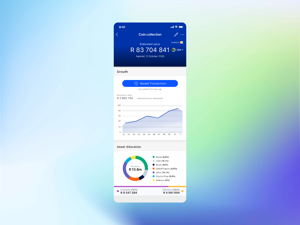
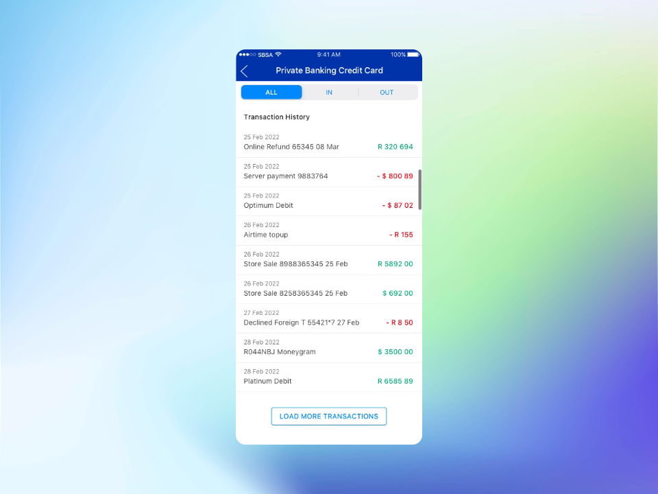
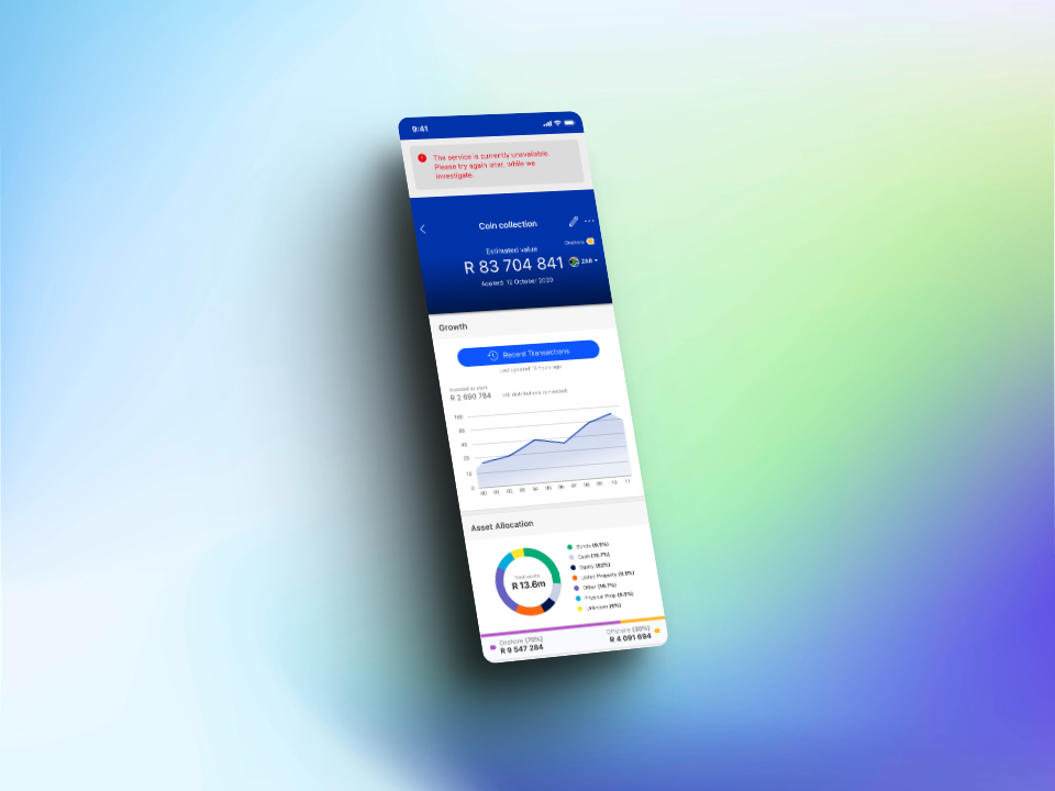
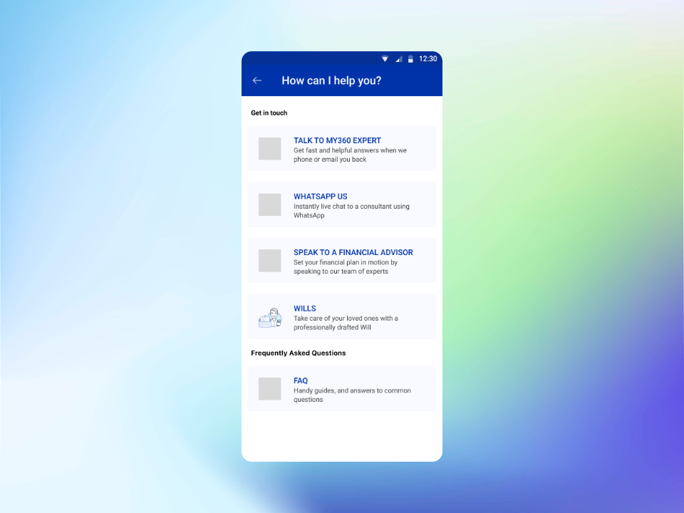
Transaction List Enhancement
A quick-access button was added to the landing page to give users faster entry into their transaction history. Error handling was also improved: previously, a service failure would leave the screen empty. The updated design displays both the transaction list and a contextual error message simultaneously, so users receive feedback without losing access to available data.
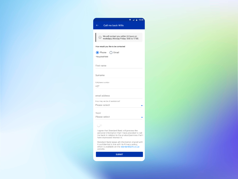
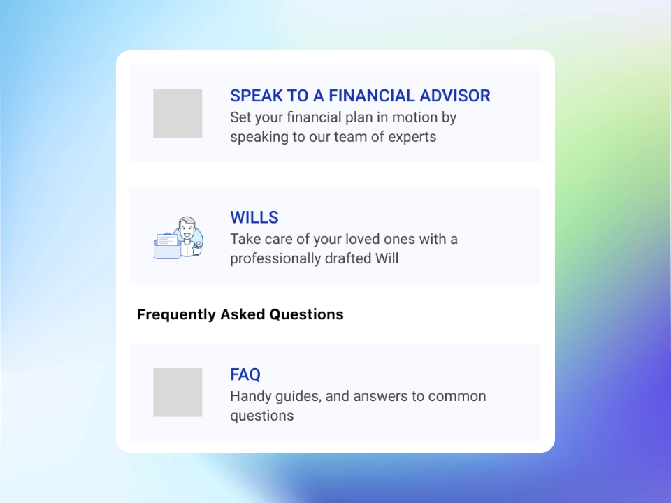
Will Appointments
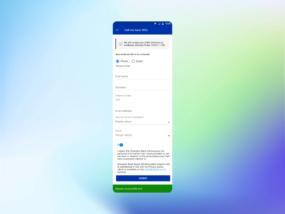
A new section was added to support life events, specifically the ability for customers to manage Will Appointments and initiate estate-related processes. An existing contact form was repurposed and adapted for this context. Custom iconography was created to give the section a distinct and appropriate visual identity. A success confirmation screen was designed to close the interaction clearly, and contextual information about bank working hours was positioned under the app header for easy reference.
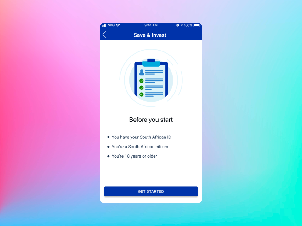
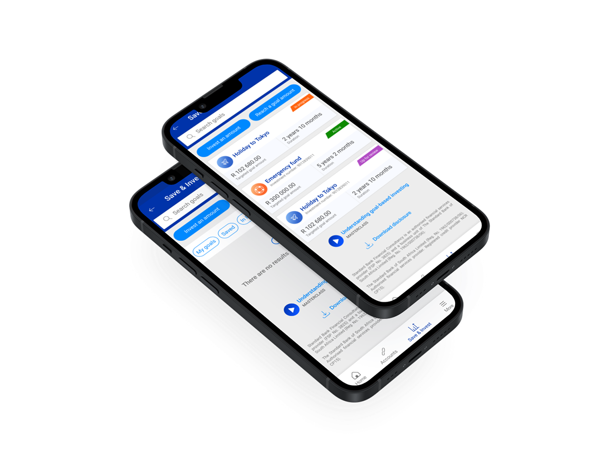
Save and Invest Feature
The Save and Invest section received several targeted improvements to reduce friction and improve clarity at key decision points in the investment journey.
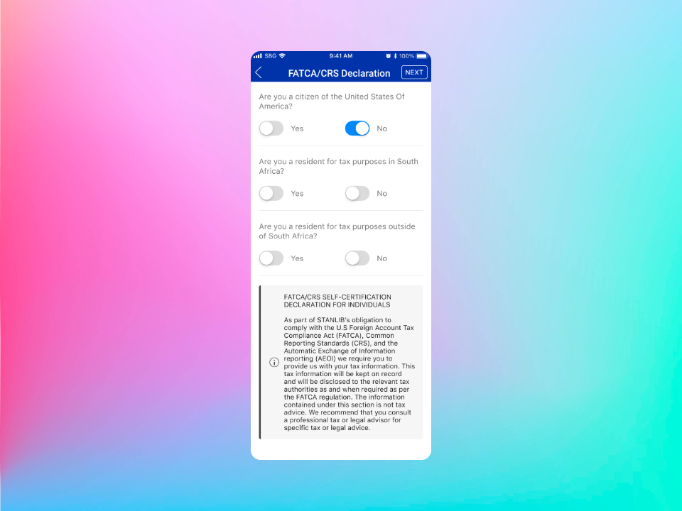
Prerequisite screens
Added informative landing screens outlining what customers need before they can proceed, reducing drop-off from unmet requirements.
Goal search
Added search functionality for filtering goals by type, making the goal selection experience faster for customers with multiple goals.
Screen consolidation
Three separate screens in the goal declaration flow were consolidated into a single screen, reducing unnecessary steps.
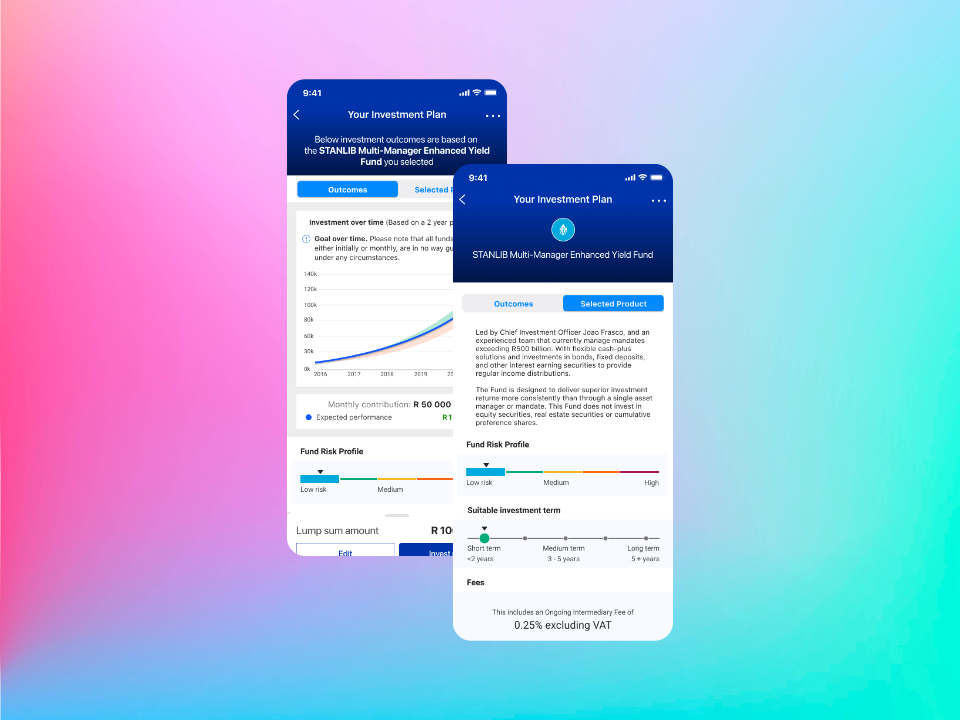
Graph introduction
A disruptive pop-up that appeared when introducing the outcomes graph was removed, allowing users to reach the data directly.
Tab relabelling
The "product" tab was relabelled to "selected product" for improved clarity at the point of decision.
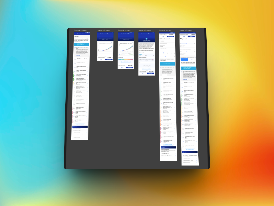
Fund Categorisation System
A colour-coded risk categorisation system was designed to help customers quickly understand the risk profile of each fund without requiring financial literacy. Each risk level was assigned a distinct colour to create an immediate, intuitive visual hierarchy across the product catalogue.
Fund Expansion
The product catalogue was expanded from 6 to 22 funds, adding 16 new fund options. The expansion was executed efficiently using pre-designed Figma components from the existing design system, ensuring design consistency across both Android and iOS without requiring new component work. The categorisation system introduced in Enhancement 4 was applied across all 22 funds.
6
Starting funds
+16
Added
22
Total funds
Design Process
Working within an enterprise design system at scale
Design System Compliance
Every screen was designed to comply with the Standard Bank Group design system. This required working within established component libraries, typography scales, spacing rules and interaction patterns, while still delivering meaningful improvements to each flow.
Research-Informed Decisions
The UX designer on the team led the research and journey definition. The UI design work translated those insights into precise screen layouts, ensuring that data-backed decisions about flows and hierarchy were faithfully reflected in the final interface.
Figma Component Efficiency
Pre-built Figma components were used throughout, particularly during the fund expansion from 6 to 22 products. This approach allowed significant scope to be delivered quickly and consistently, without introducing design debt or visual inconsistency.
Dual Platform Delivery
All enhancements were delivered as separate Figma screen sets for Android and iOS, accounting for platform-specific patterns while maintaining a consistent product feel. Both versions were production-ready for handover to the development team.
Outcomes
A wealth app that serves more customers, more clearly
Each enhancement was designed to remove friction at a specific point in the product experience. The transaction list changes give customers faster access to financial data. The Will Appointments addition extends the app into a meaningful life event category. The Save and Invest improvements reduce drop-off in a high-value flow. The fund categorisation system makes a complex product catalogue immediately readable.
Across all five areas, the design work maintained full alignment with the Standard Bank Group design system, which is a requirement that ensures the My360 experience remains coherent within the broader digital banking ecosystem. The consistent use of existing Figma components also means the development team could move from design to build without additional rework.
Good enterprise UX is not about visual novelty. It is about precision: finding the exact moments where the experience creates friction and removing them without disrupting the system around them.
What This Demonstrates
Capabilities relevant to any mobile app partnership
Interested in a mobile app design partnership?
Explore mobile app product design